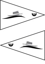
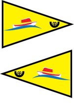
That's the one! Just need to add some color, ya know, like blue for the boat.Da Nag":1ku59x03 said:
You are using an out of date browser. It may not display this or other websites correctly.
You should upgrade or use an alternative browser.
You should upgrade or use an alternative browser.
C-Brat Burgee: redux
- Thread starter Jazzmanic
- Start date
olsurfdog
Member
- Joined
- Nov 12, 2009
- Messages
- 185
- Reaction score
- 0
- C Dory Year
- 1989
- C Dory Model
- 22 Cruiser
- Hull Identification Number
- DOR22431G989
- Vessel Name
- Summer
Come on gang-a poll to decide is too easy! We're not going to wimp out before we get to 11 pages are we? How about a poll to see if we do a poll!!! :?
Onward!!
Onward!!
bridma
New member
- Joined
- Sep 13, 2011
- Messages
- 1,155
- Reaction score
- 0
- C Dory Year
- 2009
- C Dory Model
- 22 Cruiser
- Vessel Name
- Nomad
Just about everyone who is interested has now had an opportunity to voice their opinion. Now it is time to move on. Who ever is taking the responsibility for placing an order at the 'sew' shop should pick a design, post it on this site with an approx of price, take orders, and get 'em made.
Martin.
Martin.
- Joined
- Oct 23, 2003
- Messages
- 2,870
- Reaction score
- 10
- Location
- Port Angeles
- C Dory Year
- 1995
- C Dory Model
- 25 Cruise Ship
Bill K
New member
- Joined
- Sep 28, 2012
- Messages
- 314
- Reaction score
- 0
- C Dory Year
- 1989
- C Dory Model
- 22 Cruiser
- Vessel Name
- NIC'L PIC'L
My yacht club burgee on the bow of my 22' is 14"H x 24"L
Bill Kelleher
Bill Kelleher
bridma":10fx5m9z said:We have not discussed size yet ! :lol:
Martin.
- Joined
- Oct 23, 2003
- Messages
- 2,870
- Reaction score
- 10
- Location
- Port Angeles
- C Dory Year
- 1995
- C Dory Model
- 25 Cruise Ship
bridma":1evnu67a said:We have not discussed size yet ! :lol:
Size doesn't matter. Wait - did I really just say that?
Size certainly matters for the finished product, but from a design perspective - proportion is all that counts. Assuming we stick with the standard burgee triangle format, everything I'm seeing at the usual places indicates it's 1.5:1 (W:H.)
Along those lines - here's a template for anyone else wanting to toss an idea into the mix. I've an Illustrator source file if anyone wants it, but if you've got Illustrator - you can likely whip up your own in about a minute.
I've also set up a Photo Album for folks to upload designs into - easier than digging through posts to find them all.
Burgee Design Album

Thanks Bill. I've been out on the boat with no Internet. Great idea about a design album. Ill add a few more ideas when I return. Hopefully we can all decide on a design in the next few days.
Btw, on the burgeeshoppe website, it looks like they suggest 18 x 12 for boats 20-30 feet and 14 x 21 for boats 25-35 feet.
Peter
Btw, on the burgeeshoppe website, it looks like they suggest 18 x 12 for boats 20-30 feet and 14 x 21 for boats 25-35 feet.
Peter
hardee
Well-known member
- Joined
- Oct 30, 2006
- Messages
- 12,663
- Reaction score
- 30
- C Dory Year
- 2005
- C Dory Model
- 22 Cruiser
- Hull Identification Number
- Brat # 2202
- Vessel Name
- Sleepy-C
I do like the simplicity of Bills design. My thinking of the lettering is that anyone who has any/much western background may be seeing a "brand" that says "Rocking Boat" as in the the Rocking Boat Ranch or some variation of that. Or Rockin TB. Rotate it back to vertical and that goes away.
I have now problem with just the original boat picture, and I do like the association to the C-Brat group so I think my favorite was the one that combined the picture and the C-Brat name.
I also agree that we should be looking at jacket patches, (2 sizes, on for an arm or chest patch and one for a back patch) and decals for the tow vehicles. OK, so I like my boat some, and this group too.
Harvey
SleepyC:moon
oldgrowth
Active member
- Joined
- Jun 27, 2005
- Messages
- 2,199
- Reaction score
- 0
- C Dory Year
- 2002
- C Dory Model
- 16 Cruiser
- Hull Identification Number
- CD015406H102
- Vessel Name
- C-Voyager
I think Bill has the right idea. Here is another variation of it. The little boat is the C-Brat logo at the top of every web page so why not use it for our burgee. Change the C-B a little so it does not look like a brand and it is readable from either side.
You can change the colors of the flag, borders and text but keep the logo as it is on the web pages. So any color used for the rest of the burgee will have to go with the C-Brat logo.
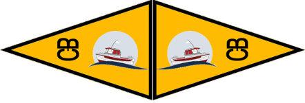
Dave
www.marinautboats.com
You can change the colors of the flag, borders and text but keep the logo as it is on the web pages. So any color used for the rest of the burgee will have to go with the C-Brat logo.

Dave
www.marinautboats.com
hardee
Well-known member
- Joined
- Oct 30, 2006
- Messages
- 12,663
- Reaction score
- 30
- C Dory Year
- 2005
- C Dory Model
- 22 Cruiser
- Hull Identification Number
- Brat # 2202
- Vessel Name
- Sleepy-C
Dave,
I like it. I don't have the skills to do this but I'm pretty sure it would decrease the expense, (maybe only slightly) but I would drop the yellow and use the light blue of the circle around the boat as the whole background.
Might be a more appealing color to fit with more boats and look less like a caution flag :lol:
ON EDIT: Since this pix is the small C-Dory, (16), it could be possible to also have the pix of the other sizes too, (maybe since the 22 Cruiser is the most common, but also it could be modified for each model).
Nice work Dave.
Harvey
SleepyC:moon
eanorris@telus.net
New member
- Joined
- Jan 12, 2013
- Messages
- 9
- Reaction score
- 0
- C Dory Year
- 2007
- C Dory Model
- 16 Cruiser
- Vessel Name
- The Black Pearl
Dave, you've got my vote. Will have to choose the colors carefully however.
Thanks and nice work!
Alan
Thanks and nice work!
Alan
- Joined
- Oct 23, 2003
- Messages
- 2,870
- Reaction score
- 10
- Location
- Port Angeles
- C Dory Year
- 1995
- C Dory Model
- 25 Cruise Ship
I'm certainly in favor of using the unadulterated C-Brat logo as Dave did. However...
The reason I didn't on mine, is based on the assumption it's too fancy to be done via colored fabrics sewn together. Per Joe's earlier comments, images with that much detail might need to be screen printed.
Personally, I prefer the following design concepts - regardless of what anyone comes up with:
- No screen printing (fades with time, and the added details are quickly lost just a few feet out)
- Reversible (no names/phrases/letter combinations that don't look the same reversed)
Here's another option similar to Dave's, using our "official" logo colors, keeping the boat simpler, incorporating the circle and an attempt to change the CB to something that looks less like something you would find on cattle ass.
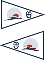

dotnmarty
Active member
- Joined
- Nov 3, 2003
- Messages
- 4,209
- Reaction score
- 1
- C Dory Year
- 1993
- C Dory Model
- user_field_choice.c_dory_model_16_Angler
- Hull Identification Number
- DOR15295C393
- Vessel Name
- LIZZIE II
Beautiful! Don't change a thing. On to production! How much? Where do I send the money? :thup
hardee
Well-known member
- Joined
- Oct 30, 2006
- Messages
- 12,663
- Reaction score
- 30
- C Dory Year
- 2005
- C Dory Model
- 22 Cruiser
- Hull Identification Number
- Brat # 2202
- Vessel Name
- Sleepy-C
DaNag, I like that better, and it does accentuate the scalloped sheer stripe which is an identifier of the C-Dory brand. AND it is less "brand like" too.
Thinking the brow should have the sheer stripe color and the window should be white or clear (== the same color as the background field). Might need to be white if the field is the light blue in order to give the cabin window shape.
Still far better than I could do.
Thanks for the revision.
I'm in on this.
Harvey
SleepyC:moon
- Joined
- Oct 23, 2003
- Messages
- 2,870
- Reaction score
- 10
- Location
- Port Angeles
- C Dory Year
- 1995
- C Dory Model
- 25 Cruise Ship
Bill K":2u0cahoo said:I read letters left to right, not up and down.
I feel like I have to have my head sideways to read the letters.
Understood...but as has been stated here a few times, using letters/phrases will always involve trade-offs.
With few exceptions, letters are not reversible. And, even for the subset of letters that are reversible - only a single letter can be reversed and look normal, not combinations of them.
To get around this, you either have different designs on each side of the burgee (added cost/complexity, not uniform appearance), or accept one side as backwards - ugly and amateurish, IMO. Or, as we've done with a few of the designs here - flipped the C-B sideways, as with a little trickery of fonts that orientation IS reversible.
Here's an example of the one I just posted with letters oriented normally on the front side. Me - I'd not fly this. Can't stand the look of the backwards letters on the one side.
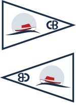
I think we're just about there. A couple of notes:
On the color scheme I think we should try to incorporate all the standard C-Dory colors: blue, green, red, grey, black, and white. So I suggest a green boat on a blue wave in a grey circle against a white background, red letters and a black border. Or something along those lines.
Another cool observation: I noticed the C-B running vertically looks like a smiling face. 8) Indicative of the C-Brat culture, I'd say.
- Joined
- Oct 23, 2003
- Messages
- 2,870
- Reaction score
- 10
- Location
- Port Angeles
- C Dory Year
- 1995
- C Dory Model
- 25 Cruise Ship
C-Dawg":1g3rp3et said:Another cool observation: I noticed the C-B running vertically looks like a smiling face. 8) Indicative of the C-Brat culture, I'd say.
I wondered how long before somebody noticed that. Less than an hour, so I guess it's not very subtle.
I'm not going to take any creative credit, as it wasn't intentional. It was simply a lucky artifact of turning the letters sideways and adjusting the spacing to look more like Dave's. I was pleasantly surprised when I saw it as well... it is indeed, fitting.
