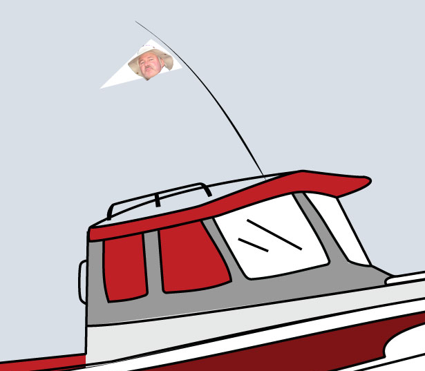
C-Brat Burgee: redux

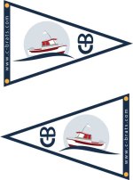
Two more. Wider band w/URL and grommet locations. One with the simpler logo variation, one that more closely resembles our official logo. Again...the fancier one looks great here, but the detail will likely be lost when flying it, and production cost may be high (or require screen printing.)

The URL can likely be reversed easily, as I'm guessing it would simply be embroidered on the cloth that runs along the edge. Probably add some cost, but maybe worth investigating.
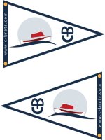
cbb_7.jpg
cbb_8.jpg
 
Bill K":187rr63r said:
I read letters left to right, not up and down.
I feel like I have to have my head sideways to read the letters.
Bill Kelleher

It is the secret C-Brat monogram.......kinda like the secret C-Brat handshake. :wink

(BTW, I like what you folks are coming up with!)
 
Bill, really nice job on the last two (with the window outlines.) GREAT and yes I'm sure the URL on the seam will add some cost, but I think it should be there. (Helps to spread the word -- we are proud of our boats and of our group, pub, family, menagerie, or yacht club -- what ever you want to call it.)

The url running vertically along that edge< is someone is inclined to, or is close enough, to read it, also is running parallel to the C-B lettering on the point. Make it easier to figure that out too.

There's my $0.02 worth for anyone counting.

Harvey
SleepyC:moon
 
Bill – good points about the CB logo I used in my design. I see the C-B font is the same as used on the web page logo. I was not able to find the font so I just used one I had.

I, like Harvey like the bottom ones but delete the horizontal line on the outboard, delete the hand rail and delete the bottom horizontal line under the hatch. This will eliminate more of the detail and make it easier to embroidery.


Dave dlt.gif
www.marinautboats.com
 
Dave,

Good eye. Those deletions probably would not be noticeable on the finished product. I'm still trying to figure why the side windows are red instead of white, like the front ones. Guess it would be OK either way. I am liking it a bunch.

Harvey
SleepyC:moon
 
I , too, like the bottom two and agree with Dave on removal of the fine line details. Making all the windows white smooths out the outline and form of the cabin. This burgee will most likely be see from over 10 ft away and here the detail will be lost anyway.

Maybe if the circle were about 10% darker it would help the boat outline and contrast.

Art
 
I'll try and incorporate some of the details/simplification suggestions later today, and get new versions of mine posted.

RE colors - I'm not certain, but I'm guessing that's an area we might not have a ton of flexibility when going the applique route. Unlike screen printing, colors will be limited to available fabrics...so I'd not expect an exact match to the images any of us are providing.
 
My only suggestion would be to have the bow of the boat facing the mast side of the flag, not the pointy end. This would make it appear that the boat was moving in the right direction as the wind blows the flag while underway.

Rick
 
416rigby":in30fb00 said:
My only suggestion would be to have the bow of the boat facing the mast side of the flag, not the pointy end. This would make it appear that the boat was moving in the right direction as the wind blows the flag while underway.

Rick

Changing the boat orientation would also make the pennant on the boat emblem reflect the shape the burgee itself.

If these are embroidered (or if at least the boat emblem is) you could conceivably have it so that people could order the trim colors of the boat on the pennant to match the color of their boat. It might make cost a little higher, but it would be a simple change to the setup of the computer embroidery machine to change the color of the trim of the boat emblem.

If you drop the grey disk behind the boat (yes, I know it is the logo on website) and shrink the wave size a little you can make the boat emblem a bit bigger without crowding the edges too much. If you want to keep the logo intact, I would cheat the wave size a bit at the aft end of the boat a little to move the boat emblem more to the center of the space between the CB and the vertical edge. The grey disk is a little to close to the top edge (compared to the whitespace below the wave) IMO. If you're not a C-Brat you'll never notice the difference (most C-Brats probably won't either).
 
ssobol":12gidpwx said:
416rigby":12gidpwx said:
My only suggestion would be to have the bow of the boat facing the mast side of the flag, not the pointy end. This would make it appear that the boat was moving in the right direction as the wind blows the flag while underway.

Rick

Changing the boat orientation would also make the pennant on the boat emblem reflect the shape the burgee itself.

If these are embroidered (or if at least the boat emblem is) you could conceivably have it so that people could order the trim colors of the boat on the pennant to match the color of their boat. It might make cost a little higher, but it would be a simple change to the setup of the computer embroidery machine to change the color of the trim of the boat emblem.

If you drop the grey disk behind the boat (yes, I know it is the logo on website) and shrink the wave size a little you can make the boat emblem a bit bigger without crowding the edges too much. If you want to keep the logo intact, I would cheat the wave size a bit at the aft end of the boat a little to move the boat emblem more to the center of the space between the CB and the vertical edge. The grey disk is a little to close to the top edge (compared to the whitespace below the wave) IMO. If you're not a C-Brat you'll never notice the difference (most C-Brats probably won't either).

SSOBOL, yes on all counts. My only qualms about the "final" design is the gray circle around the boat and the color. As those who have seen C-Dancer, C-Dory green is the only color possibility on our boat. :wink

What say you Bill, do you think it's possible to order other colors?
 
RE: Da Nag's most recent iteration of the burgee: Overall design is good (although it may be just a bit too "busy" when compared to other typical burgee designs). Size of each of the elements is good. Proportion between elements is good. Edge spacing is good. Overall white space is good. The simplification of the C-Brat's boat logo (dropping some of the fine lines) makes it cleaner, yet it should still be recognizable at a distance, without drifting into the schematic realm. Orientation of the boat/wave element may make more sense if it was reversed (so that the "burgee boat" would be travelling the same direction as the boat on which it was mounted), but I think that doing so may kill all of the other good aspects of the design. (i.e., turning the boat around will force other changes.)

It may not be perfect, but I happen to like it the way it is. And, unless there's an entirely different concept that emerges, most everything from here on out will likely fall into the "tinkering" and "can't please everybody" categories.

Of course, we could always go with this classic design. :cat

brock-flag.png
 
Im Really Late to this discussion. Can someone tell me what is the official design going to be (including colors).

I was trying to follow the thread and it went in lots of directions including link to the original thread.

Just the official design that we are all going to use please. That way, I can decide to order one.
 
Our old Yacht club burgee was a 13"x19" triangle. Having looked around yacht club rooms where burgees from many clubs are displayed that seems a pretty standard size. We would prefer bright colors and are quite willing to leave the final design to Bill and Mike.
 
Some updates, based on feedback from two different burgee designers:

- Personalized boat colors ain't gonna happen. It will drive the cost up significantly for everyone, not just those wanting a custom version. Reason being - we'll lose out on quantity discounts, as they only apply to a single design. So, if this is a deal killer for you and your name is on the list - drop me a PM and let me know. No harm, no foul.

- I'm being told (as expected) that we need to simplify things, as there's too much detail given the size of the burgee. Working on options there, and I'll provide more details as they are presented.

- One company suggested we could keep more detail, if we went with a combination of applique and embroidery. Basically, the wave and the background circle would be applique, the rest of the boat embroidery.

- While I'm still aiming for a cost of $30 max, we're very close to that. It won't be much cheaper (if any) unless we seriously reduce the complexity.

- These won't be provided any time soon; all of the companies have 4-6 week lead times. Further delaying things, is my desire to get a sample done first, then have the batch done. This is a lot of $$ to end up with 60+ burgees that look like crap. Not only does a single burgee cost quite a bit (all the design fees still need to be paid), but once in hand the rest of the order could still be a few weeks out.

Patience, C-Brats - it will happen. We've waited this long, let's do it right.

More news when it happens...
 
It is taking shape and looking great and what ever the final out come will be fine. Life if is to short to sweat the small stuff. Great job and thanks for taking it on. Might have to pick up at the Friday Harbour gathering if shipping to the frozen north is a issue but will pay for in advance. Just let us know when all is said and done.
T
 
Bill,

From my limited experience, slow and steady, or one step at a time and get it right is the way to go. You are doing a good job and I am looking forward to the final outcome. I'm OK with the KISS system too.

GO Bill :!: :!:

Harvey
SleepyC:moon
 
Thanks for the update and for taking on this project Bill. I personally am in no rush. As the prime time boating season is pretty much over for me, time is not an issue. And I am totally fine with the colors we pick. Onward and upward!!

Peter
 
Back
Top